Have you ever wondered or noticed why certain films look a certain way tonally? It is not just a simple matter of color grading an image in post-production. A director works closely with a director of photography, production designer and costume designers to create a color palette that fits the story of the film. The color of the film is controlled on a set. Each story itself can be told in a plethora of ways – meaning, depending on what that story is about, and what is the thematic underpinning of it – the look of the film will often be based on those factors. For instance it may depend on the setting and the world within which the story takes place; time period, location of it. Therefore the color palette of the film will largely be dictated by these elements. So let’s start looking at some examples..
In a scene from The Usual Suspects below… look at this image, and try to see why it’s visually appealing as well as, in a sense, homogeneous.

See it?
How about…

It’s pretty cold isn’t it? Now imagine if Spacey was wearing an orange suit — wait, how about if all of them wore t-shirts of different vibrant colors. The image wouldn’t look correct, because it wouldn’t match the background, the walls. This is carefully selected, so it’s visually “in sync” so to speak with the environment. If you take it a step further, why these suits were chosen also fit what the scene is about. If you can recall it, it’s an infiltration so they have to blend by acting like service people. The backgrounds are carefully chosen however so that visually everything you see is appealing to the eye, so you don’t question its validity.
Let’s take a look next at Die Hard, and The Thomas Crown Affair. Why are flares for instance are used? It is afterall an element of the photographic process. Before JJ Abrams and many of the music video directors began to use it as a stylistic choice (at least in music videos) – John McTiernan and Jan de Bont were purposefully creating flares in Die Hard, and McTiernan on his own chose to utilize them in a scene, early on in The Thomas Crown Affair. Now one can definitely make a case for Abrams using flares not only as an emulation of Spielberg, by whom Abrams has largely been inspired – but using flares in Star Trek simply to make a film feel as if it is set in a distant future. Hence, it is not simply used as a stylistic choice, but a choice that adds to the story.
Take a look at the below video in which I’ve selected two bits from McTiernan’s comments on Die Hard and The Thomas Crown Affair to see how and why they’re used.
Notice how McTiernan uses the lens flare to his advantage – it actually means something within the scene it occupies. The dramatic value it creates cannot be argued, because it adds a certain sense of urgency, tension, and suspense.
Let’s take a look at another example of how a lens flare is used for a dramatic effect which adds value to the given scene.
In the film Rust and Bone – (very slight spoilers) – there is a scene in the film where Marion Cotillard’s character has spent a few months inside her house, away from everyone, depressed and lonely. Now she finally makes her way outside, where it’s bright and sunny. Light breaks through clouds and hits her face. The use of flares is quite heavy. The frame is filled with glares and flares. It’s overbearing, and it’s blinding to her and to us. However why it is used, is more important. It’s in no way a stylistic choice that has no meaning or purpose. The flares are full of purpose, because considering the fact she’s been in a self-imposed lockdown for months, in darkness – and she sees light for the first time – it’s blinding to her physically – and emotionally the flare’s use is logical. It’s overbearing.


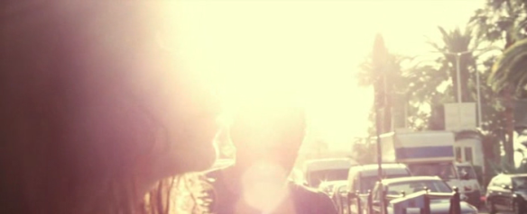
This kind of use of flares or any photographic flaws – have purpose and drive the story and scene in which they’re used. The audience may not be consciously aware, but they feel it has meaning. In the back of everyone’s mind, they feel that its given use is right
Which brings us to a scene in The Dark Knight which is similar in execution, only the use of a flare is substituted with a powerful, overexposed light.
The Joker sits calmly in the interrogation room, which is lit only with a lamp on the table. It’s emotionally calm – the light creates this calm environment, no matter how dark the room actually looks. 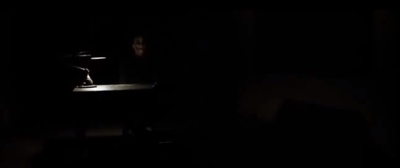

Cut – immediately – to an entire room filled with harsh, hard light – and a sudden slam of Joker’s face against the table.
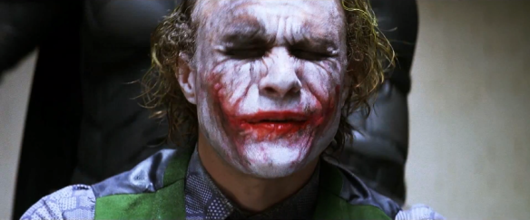
This combination of harsh light, and the abruptness with which Batman slams Joker’s face against the table is masterfully executed by Nolan and Pfister to give the audience a jolt from calmness to a much more frenetic emotion. However, it’s the light itself that is the half of this emotion.
The particular scene itself, and the lamp lighting also serves another purpose, actually two.
- It makes the Joker look menacing by the way he is lit. Adding to the characterization.
- When the lights are switched on, we find out Batman was there the whole time – listening, being the detective that he is. Trying to glean information from the Joker, if any can be gleaned from him.
Light affects the audience’s feeling and emotions of scenes based on how it’s used. Next time you watch a film, pay close attention, be aware of the light of the given scene. Also, recall from your own life how you feel during certain moments of the day; afternoon – when the sun is directly above you, harshly bright, mid-afternoon – when they light becomes less harsh, the magic/golden hour – when the sun casts a beautiful warm glow to everything… Try to think how you feel during these moments of the day, or when you’re in a brightly lit room as opposed to a minimally lit room; how do you feel ?
Directors and DP’s exploit light to make the audience feel what they want them to feel in any given scene. Most of the time, none of this is left to chance – it’s planned, and executed to drive the story. Everything in film in essence is guided by the story and its themes.
If you take a look at this example from the opening scene of Joe Versus The Volcano – you’ll see the elements discussed above, and how they align with the content/story of the given scene. Joe works a dead end job which depresses him entirely.

This is his office. Take a look at the brick wall, its color, Joe’s suit is navy blue – the lamp is also blue (the sailship is actually his “dream” – in the same way Jamie Foxx’s “island” photo is his ‘dream’ and ‘escape’ from reality in Michael Mann’s Collateral)
Look at the light which falls on Joe’s face that the fluorescent lights create. It’s nauseating, just like he feels. Have you ever felt that way in a certain environment? I’d bet you have. Again, all of these elements are harmoniously fused to create this feeling. But the feeling is correct for the given scene and what it represents.
Now look at the following examples below, study them, analyze them, and see how color, light, production design play a role in creating a certain look for a film.
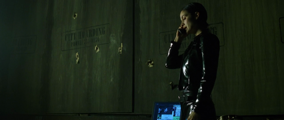
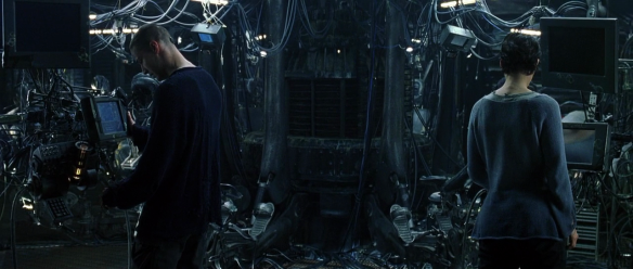
THE MATRIX
A lot of people who find this film to be something “cool” are people who simply look at a film and observe the surface. However, The Matrix’ green tint (and blue, which gets lost in discussions of the film’s look) are actually representations of the opposing realities. The green tint isn’t there simply for the film to look cool, it is there for a reason. It is the matrix. Its color palette is based on the green text code that is by now a part of pop culture easily recognized.
The film has another reality, which is represented by the use of a muted, blue tint. This reality is the real world (that’s also debatable if you watch the subsequent sequels). These color choices are carefully selected so as to not only thematically, and symbolically represent the different, opposing worlds, but as to not confuse the audience as to what is going on, on screen.
Let’s take a look


As you can see, this is the matrix world, and it is represented by green tint. However, pay careful attention how the scheme is executed. It’s not simply a matter of shooting something and then just color grade it in post. As mentioned previously the color is controlled on a set. This means, it’s the wardrobe, it’s the props, it’s the production design, it’s the lighting. Study closely these images and look at how every element that occupies the frame makes the image somehow “right” for the frame. This is important. You can’t just have Neo – in the above image – wear a red suit, it just wouldn’t work. Careful selection and consideration must be taken when approaching how one is to film the scene. It truly is no different than painting, the frame is your canvas, and you fill that canvas with different colors.
Now let’s take a look at the real world. The blue tinted reality.


Do you notice how essentially every element of the frame supports that blue tint. Look at the sweaters they are all wearing, they’re grey – occasionally you get some color, like Cypher’s maroon vest – notice, it’s not bright red. It’s muted. All these color choices are carefully selected, never underestimate color and how it aids the particular look you are going for.
Study the rest of the images carefully.


ROBOCOP
Robocop’s color palette is no different; meaning the choices for the light, wardrobe, and locations are all carefully considered and are all there to represent the world in which the story takes place.


It’s got a very muted, cool color palette. The greys, blacks, and muted navy blues are harmonious. They represent the world, the setting (a futuristic Detroit) and the seedy underworld of it all. An excellent use of color.
DREDD
Now you’ve got another representation of a distant future, and there are more vibrant colors within this environment. I may be wrong on this since I haven’t checked out my facts, but I do remember a fan of the comic books commenting a few months ago on the official 2000AD forum that they actually got the colors from the comic books. Which is an example of how films and its crew can reach for the source material to tell their story.


This particular shot is done in post production, however it’s a wonderful example of the use of color to represent a concept, idea, emotion. In the given scene, it is the “lockdown” and the sense of urgency the color provides is a perfect way to represent it. Also, it fits in perfectly with the futuristic setting, as something like an entire building turning red is a plausible concept that could be implemented in a futuristic world.


As you can tell, it’s gritty and raw, yet still colorful, but the colors are utilized as elements of storytelling and not as something abstract and without meaning.
PROMETHEUS
Another example of a much more distant futuristic world. If you’ve watched the behind the scenes of Prometheus, Ridley Scott uses color thematically. It enhances the story, and moods he wants the audience to feel.


Watch how Peter Weyland, and Vickers – who are funding the expedition, are dressed. The suits are sleek, futuristic, and opposed to the crew, speak “rich” to the audience. The colors and choices are in essence thematic. Also, look at the first image and watch how the wardrobe itself is visually homogeneous with the background, and the props.

As you can see, their uniforms here are all visually similar even if not exactly the same; greys, slightly olive, and navy blues – against the silver, greenish tint. The environment is already created. The theme of the look of the Prometheus ship is established, now Ridley is not only dressing his characters thematically, but also he’s balancing the colors against the background of the sleek design of the ship.

This scene is slightly warmer, however the characters are dressed in such a way that the look works visually. Shaw isn’t dressed in a red robe, and even if she was – it would have to mean something on some level for the given scene.

Perfectly homogeneous. The colors are balanced within the environment, and they not only tell of a futuristic setting, but they have a clinical sort of feel – and it fits, because of what the scene represents, and its content.

- Follow me on Twitter
- Subscribe to my YouTube channel

Do this same, exact manner in my scripts and get shut out for directing on page. How to solve? Certain scripts set aside to direct myself; streamline others just to sell without being attached.
I believe I have just the right stuff for you, Mark – just last night I read a nice section on developing a script from Pudovkin’s book Film Technique. I’ll post those passages in a bit – he talks about these things more or less. But he argues that a screenwriter must also know the form and “mold” it visually for a director, at least enough so that your “meaning” is expressed CLEARLY. I’ll extract those in the next couple of days.
Reblogged this on CINEMA SHOCK and commented:
Cinematic storytelling is about connection between various filmmaking techniques (in this case color palette) and their function within the narrative of the film.
This excellent article guides you through color palette in various movies and answers questions to “what, how”, but most importantly answers the “WHY” question! Love it!
Excellent post! What I really, really, REALLY love is that you always say not only “what”, but also “WHY”!
I wrote an article about color palette in The incredibles, feel free to use it: http://cinemashock.org/2012/05/26/color-palette-in-the-incredibles/
Btw., re-blogged on CINEMA SHOCK!
Awesome! your article touches on these same concepts and ideas. As far as answering the why.. I try to utilize the Socratic method. It’s the best way to learn something and to truly understand it. You gotta ask the “WHY” – ALWAYS. You won’t learn anything to its maximum if you only observe it and never ask the reasons. Lastly, I do these editorials first and foremost for myself. It isn’t self-centered. You GOTTA do it and get into a habit of analysis of films, scenes, sequences if you want to grasp this language, and this blog helps me learn. What you’re doing isn’t any different. You gotta focus your attention 110% on something. It’s like my new homie Ash Thorp told me recently “Do it a 100% or don’t do it at all”
I couldn’t put it any better! We do this type of analysis mainly for ourselves, if someone else will benefit from this, even better!
I can’t even tell how happy I am that you started this WordPress blog!
A masterpiece film related to this is Bergman’s “Autumn Sonata”.
Sven Nykvist shows there why he’s one of the best cinematographers of history.
Good post.
Pingback: Color palette in The Incredibles « CINEMA SHOCK
Hello,
in the director’s commentary on The Matrix, The Wachowskis note that they used different lenses (I don’t remember it exactly) to further distinguish Matrix and the real world.
In Prometheus, and maybe it’s only my impression, when USCSS Prometheus reach the Zeta 2 Reticuli system, the corridor is lighted with purple colour, colour of death. So maybe it’s subtle hint to the ultimate fate of the ship.
Thank you for a great blog!
Cheers,
Jakub
RE both Ridley Scott and the two-worlds of the Matrix, in Gladiator I noted that Ridley used two tints for two world’s as well: blue/cold tint for the outsiders or barbarians, and warm lush Gold tint for Rome (“Rome is the light!”). Great post thanks.
Pingback: Color: Vol. 1 | filmschoolthrucommentaries
Is there a way to get a hold of the video that is deleted from Vimeo?
Pingback: Color and the look of a film – Visual Analysis | Egoïste
I remember how astonished I was when I first found out to what extent the “film look” is about controlling the color palette ON THE SET, and that most of the scenes tend to just have skin color + something.
Also I think that modern digital COLOR GRADING is worth noting, the whole “Michael Bay blockbuster look”: When you reduce the amount of colors in post processing to have skin tones in highlights and cyans in background (what creates complementary harmony).
Greys and browns also play a large role — it comes from old paintings, like german romantic paintings or XVIIIth century Dutch masters — they’re defined as to be ‘neutral’ colors, used to connect all other color harmonies together.
When you analyze “The ghost writer” (Polański/Edelman), you can see how “only brown” the movie is. Gloomy, soft lighting + desaturating it in postpro gave it a brilliant effect – very beautiful yet not artificial at the same time. Greys+browns tend to be more realistic and classy than common modern orange-cyan combination…
That was a great post, thank you !
Do you know Quora ? It’s a social network and has many interesting movie discussions, you should check it out.
no this is the first time I’ve heard of it, so thank you for mentioning it! I use Mubi sometimes or just simply post on a movie forum like JoBlo or IMDb
glad you liked it. Film is truly an amalgam of visual elements, space, line, shape, color – it’s important for a filmmaker to grasp those concepts before his work can truly begin to look great
V for Vendetta also contains this same technique you describe; looking at the color palette, a cold, pale/dull filter is imposed upon scenes taking place in the present and warm light, paired with bright yellows signals (well, it’s more of a subliminal effect) events in the past.
Check out the color palette of the computer Trinity uses while in the Matrix to “watch” Neo. Also, note the color of Carrie Anne’s eyes.
Pingback: Color and the look of a film – Visual Analysis | design + more love
Pingback: De lingüística y cine | Palabras de estudiante
Pingback: Colour | Animation
Pingback: Colour | filmandtvproduction2kerrynorton
Pingback: Evaluation | Izzy Pye
Pingback: color |
Pingback: Consistency in Photography – Marcus Kazmierczak
Pingback: Colour and feel – SHOT//SCRIPT
Thought a film that had a great use of colour for different was ‘The Little Buddha’ Agree?
Pingback: C&CS research for the essay – Anna's Blog
Pingback: 24/04/2018 Final version – Lynn Yao CSVPA
Would you be interested in an advertising service that costs less than $40 per month and sends thousands of people who are ready to buy directly to your website? Please send me a reply here: lily5885mil@gmail.com and I’ll send more details.
That is a good tip particularly to those new to the blogosphere. Short but very accurate info… Thank you for sharing this one. A must read post!
Itís hard to find experienced people about this subject, however, you sound like you know what youíre talking about! Thanks
After checking out a few of the blog posts on your site, I truly appreciate your way of writing a blog. I saved as a favorite it to my bookmark site list and will be checking back soon. Please visit my website as well and tell me what you think.
There is definately a lot to know about this topic. I really like all the points you made.